
Smart Grid Test Bed identity
Creating a community approach to energy use
Role: Lead Design, Art Direction, Strategy
PGE launched the Smart Grid Test Bed, a pilot program to launch smart grid technology in three neighborhoods, in early 2019. As lead designer, I was responsible for the creation of the program’s visual guidelines, custom badges for each neighborhood, a launch campaign, marketing and event activation design.

“Together, small changes in how and when we use energy make a big difference in building a clean energy future for Oregon.”
PGE Smart Grid Test Bed
Smart Grid Test Bed story
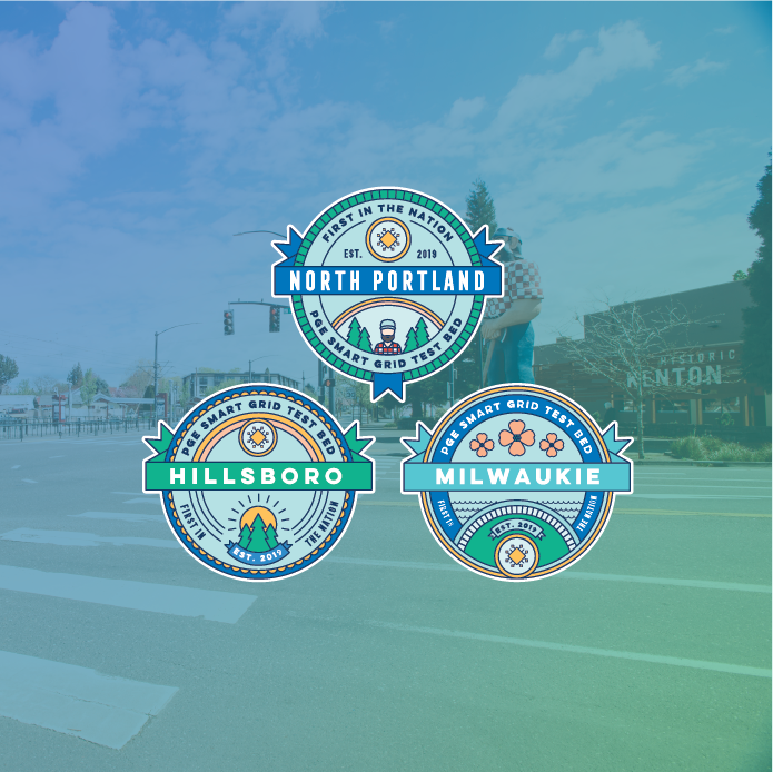
The Smart Grid Test Bed launched in the existing brand identity, just before the work with ziba was finalized, we had to push the PGE brand as far as we could in the existing visual structure. I leaned on clean typography and playful colors and illustrations to create a memorable experience for the customer. I created a custom badge for each neighborhood that included local landmarks: trees for Hillsboro aka the ‘Silicon Forest’, dogwood blossoms for Milwaukie as the dogwood capital of the west, and the visage of the Paul Bunyan statue for North Portland.
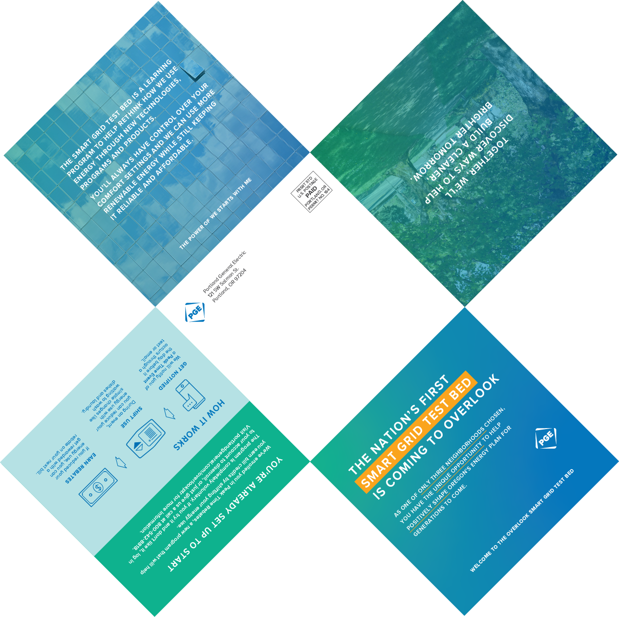
It was launched with custom die print mailers seen below, as well as at neighborhood events with giveaways included in the prize wheel.


An old program in a new brand —
Smart Grid Test Bed 2.0
With the new PGE branding and the evolving SGTB program, we knew the original branding needed a revamp.
With this brand update, we wanted our customers to: Think, as part of the PGE Smart Grid Test Bed, I am part of something special and cutting-edge. I have an opportunity to participate in pilot programs and exciting options for making a difference and earning rewards. Feel, good that I’m making the right decision for my household that aligns with my green values. Do, Go online to learn more about the PGE Smart Grid Test Bed and enroll in new projects as they become available.

Sometimes our clients really want to be closely understand all the thinking behind our decisions. The graphic above helped our client translate their engineering-focused perspective into a universal visual illustration.
Our brand identity brings together elements of Oregon culture, people and energy to create a brand that feels warm, inclusive, energetic and optimistic, like the people of Oregon. We introduced a warm and yet vibrant color palette to distinguish it in the category and shared the following with our client to connect their logic to our concept.
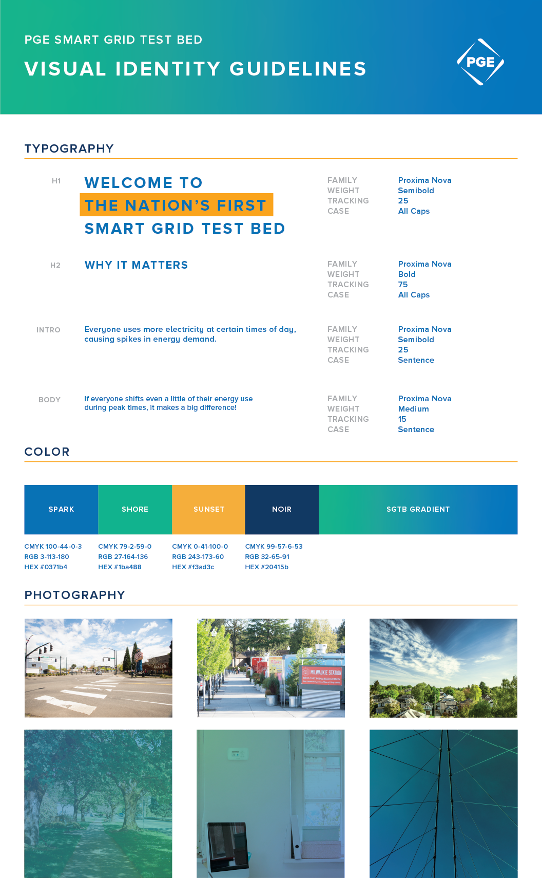
The SGTB badge palette draws inspiration from the Electric Hearth design theme. The energy of electricity is characterized by the Northwest Salmon and Electric Yellow, while stabilized by the Starlight Blue and other cooling hues. The energy world is a sea of blues and greens, but we stand out by bringing the warmth of red and yellows to add an inviting, bright energy to the design. To share the story of our clean energy future, we utilize the the clean energy palette that represents the varying types of energy generation: Hydro Blue, Solar Yellow and Wind Blue. The balance of warm and cool creates a vibrant, energetic badge that will stand out as we’re helping create a cleaner energy future for Oregon.